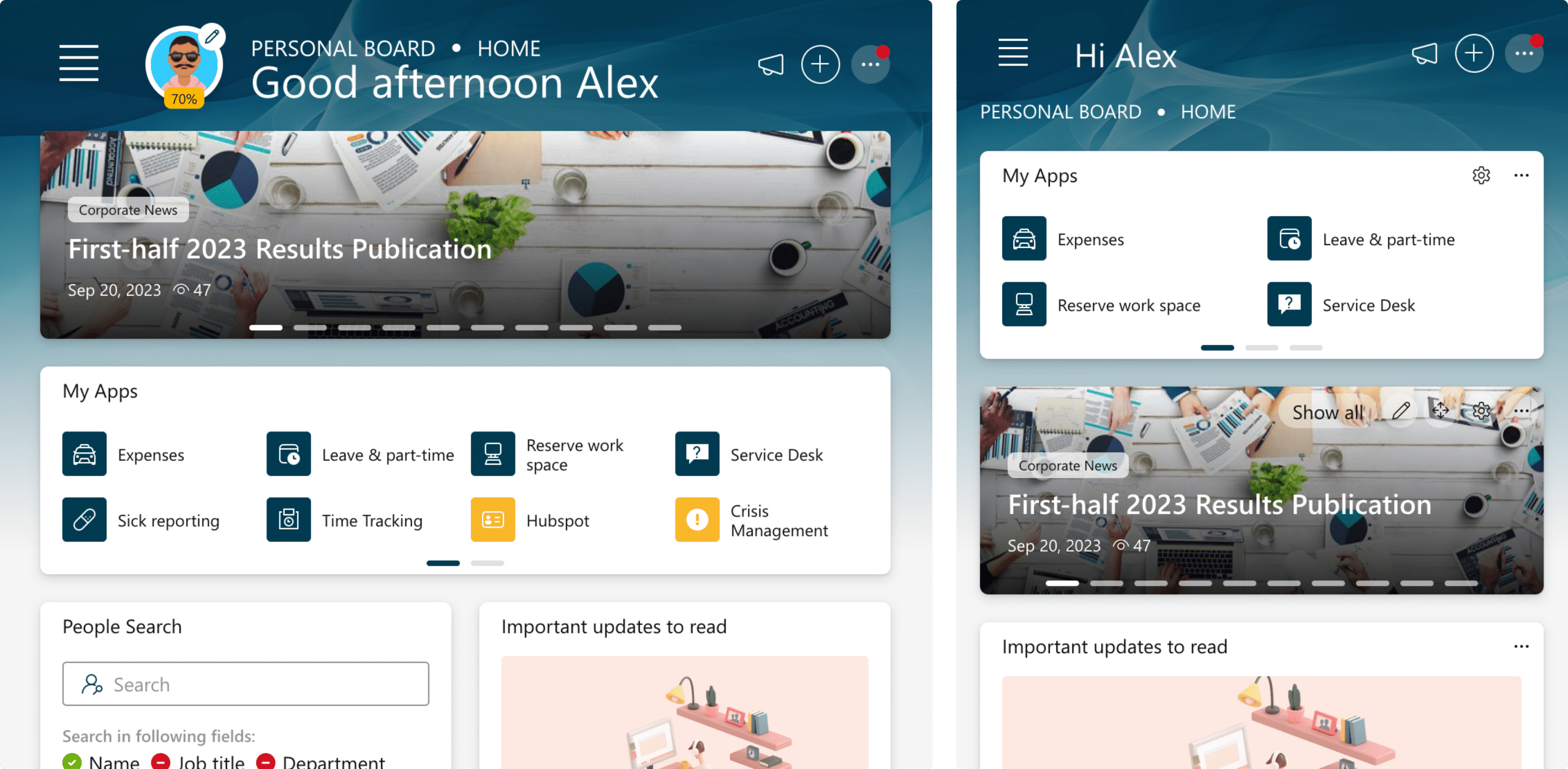
Fully Responsive

Bloom Intranet is built with mobile-friendliness and responsiveness in mind. Whether you’re on a smartphone or tablet, the platform adapts effortlessly, ensuring a consistent and user-friendly experience. This means you can access and interact with your boards on the go, without compromising usability, making collaboration and productivity truly portable.

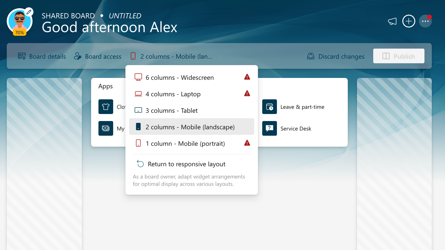
Control layout for each device

Bloom Intranet automatically adjusts grid layouts to fit any device and screen resolution, ensuring boards look great everywhere.

The board template editor includes tools for administrators to choose and modify layouts, making it easy to create visually appealing and functional dashboards across all devices.

Shared boards

Shared board owners are responsible for ensuring their boards look great in every layout. Bloom Intranet provides tools that assist board owners in designing visually appealing and functional shared boards, regardless of the device or screen resolution.

Unique personal arrangement for each resolution

Users can rearrange their boards differently for each layout. This flexibility is useful when space is limited or when certain widgets have different priorities on various devices.

Bloom Intranet allows users to customize their experience, providing an optimal interface on every device.

Conclusion

Bloom Intranet is designed to deliver a responsive and adaptable experience, ensuring that both personal and shared boards look great on any device. With built-in tools for administrators and board owners, creating visually appealing and functional layouts is straightforward and efficient. End users also benefit from the flexibility to rearrange their boards based on their preferences and device constraints.

This comprehensive approach guarantees an optimal and personalized experience for everyone, no matter how they access their dashboards.